case study 01 / 2026
NotionBench: making 890 agent rollouts legible
A results site and live run dashboard for a coding-agent benchmark. Eight agent configurations, 38 tasks, three trials each, every rollout graded by a program and never by a model.
The scores tied. The page had to show where eight nearly identical scores actually differ: consistency, cost, and the part of the platform each agent got stuck on.
- role
- sole designer and engineer
- timeframe
- Jul 31 to Aug 5, 2026 (six days, 135 commits)
- surface
- static HTML, CSS, and JS with hand-rolled SVG; TypeScript runner
- users
- engineers choosing an agent setup, and me while the run executed
live results site (opens in a new tab)source on GitHub (opens in a new tab)
01
the problem
Notion shipped a developer platform in May 2026 and said it was built for coding agents. I wanted to know whether that was true, so I wrote 38 tasks across every programmable surface, ran eight agent setups through each task three times, and had a program grade the lot. The benchmark was the easy half. The hard half was the page.
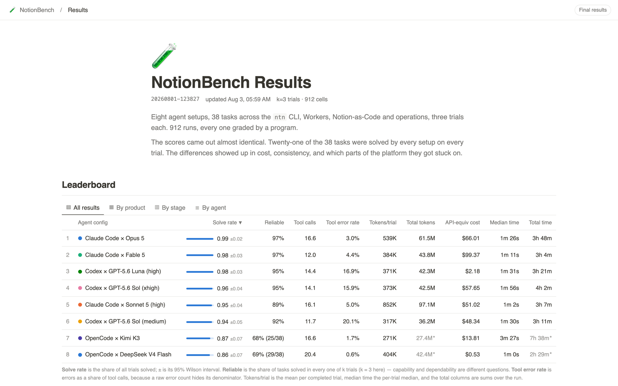
Most eval sites ship a leaderboard sorted by score. On this run the top six configurations finished within five points of each other, and 21 of the 38 tasks were solved by every setup on every trial. Ranking by score would have told a reader almost nothing. The page had to answer four different questions: which setups differ, how consistently, at what cost, and where they got stuck.
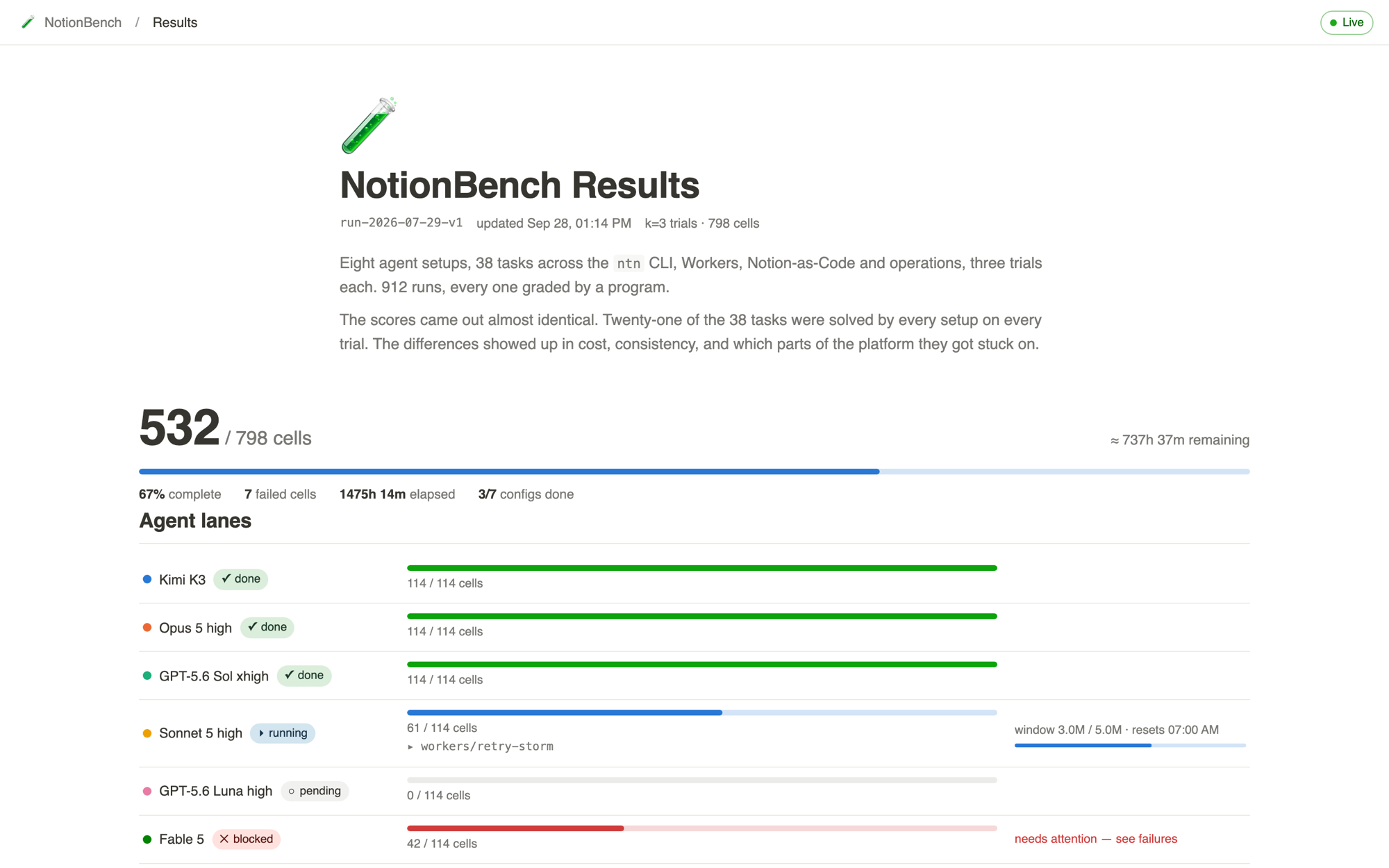
There was a second audience with a second problem. The grid is 912 cells and took about three days to run across subscription accounts with usage windows. While it ran, I needed to see at a glance whether a config was working, cooling down, quietly broken, or halted by a bad verifier. So the same page had to work as a private monitoring dashboard before it became a public report.
02
what I learned before designing
I audited the four benchmark sites I was borrowing from: Supabase Evals, Terminal-Bench, MCPMark, and tau-bench. Each one publishes a score column first. Almost none put cost beside score, and none of them separated "can solve it" from "solves it every time". Single-trial scores hide consistency by construction, and that is exactly the dimension where these eight setups turned out to differ.
The first user was me, for three days. I designed the page against seeded mock fixtures before any real data existed, then watched the live version while the run executed. Every change in the live section came from a moment when the dashboard failed to tell me something: a config sitting in a rate-limit cooldown that read as stalled, two real verifier bugs that each silently invalidated every cell that touched the task, and two OpenCode setups that ran short when their account hit a weekly usage limit.
03
key decisions
Two columns for one question: solve rate and reliable
- considered
- one score per config
- best of three trials
- solve rate with a reliability column beside it
- chose
- Solve rate (the share of trials solved, with a 95% Wilson interval) and Reliable (the share of tasks solved in every one of the three trials), as two adjacent columns.
- why
- Capability and dependability are different questions. DeepSeek V4 Flash solves 86% of trials but only 69% of tasks every time. It never failed a task outright, it just does not land the same task twice. A single number, or a best-of-three, erases that finding.
Tool error rate, never a raw count
- considered
- mean tool errors per trial
- errors as a share of tool calls
- chose
- Errors as a share of tool calls, with the mean call count in its own column so the denominator is visible.
- why
- 2.4 errors on 14 calls and 0.1 errors on 20 calls are opposite findings that look similar as counts. The rate exposed the real story: one in five Codex tool calls fails, against under 2% for OpenCode, on the same tasks in the same sandbox.
Partial data stays visible and stays honest
- considered
- drop configs that ran short
- fill missing cells with zero
- keep them, mark what is not comparable
- chose
- Per-trial means and medians stay comparable across rows. Totals for a config with fewer completed cells are muted and starred with a footnote. Reliability shows its denominator, as in 68% (25/38). Cells the usage limit prevented from running are excluded and recorded with their reason, not scored zero.
- why
- Zero-filling turns "not enough data" into "solved nothing". Dropping the rows would have hidden the two cheapest setups on the board. Muting and starring lets a reader keep the row and know exactly which numbers to trust.
One hue on the scatter, identity carried by labels
- considered
- eight categorical colors and a legend
- one hue with direct labels and a Pareto step
- chose
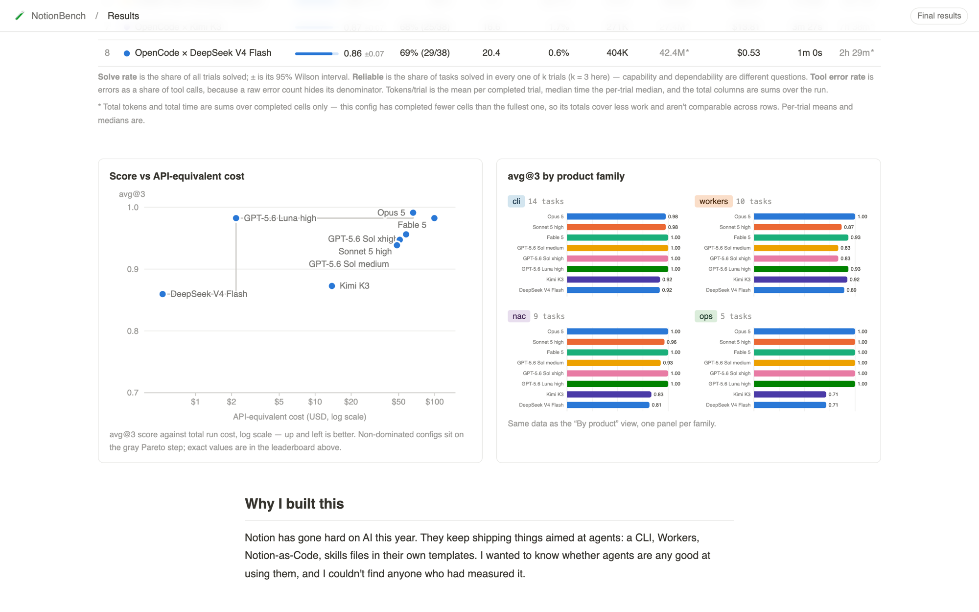
- All dots share one hue. Each dot carries a direct label with a paper-colored halo, overlaps are resolved after render from real bounding boxes, and a gray step line marks the Pareto frontier. The leaderboard sits directly above as the chart's table twin.
- why
- Seven or eight series colors fail all-pairs color-vision checks, and a legend makes the reader work a lookup table. Labels remove the lookup. The step line turns "up and left is better" into a shape you can see: Luna sits alone on the frontier at $2.18.
One page, two modes, one file that knows the wire shape
- considered
- a separate monitoring app for the run
- one page that switches mode from the URL
- chose
- The same page loads a static results file by default, or polls a bearer-protected status endpoint every ten seconds when the URL carries an api parameter. A single schema adapter is the only module that knows the runner's payload, and a test pushes a real payload through it so contract drift fails CI.
- why
- Two apps would have drifted. The monitoring view is where every design flaw surfaced first, and fixing it there fixed the public page for free. The adapter kept every other module reading one normalized shape.
Refuse to invent data, and distinguish "nobody looked" from "someone looked"
- considered
- a usage-window meter estimated from token counts
- omit the meter when the CLI does not report it
- chose
- The usage-window meter renders only when the runner can report it; subscription CLIs cannot, so it is omitted rather than estimated. The watchdog's alerts have three levels: halt, warn, and acknowledged, where acknowledged means a human reviewed the shared failure and recorded why.
- why
- An estimated meter would put a fiction on the dashboard in exactly the moment I was relying on it. The acknowledged level exists so the dashboard can show that a suspicious failure has been read and explained, instead of folding it into a generic warning.
Notion's visual vocabulary, without counterfeiting it
- considered
- a generic dashboard look
- a page that reads like a Notion database
- chose
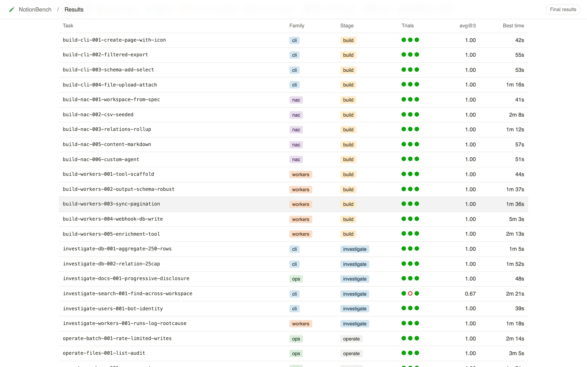
- View tabs with icons, select-tag pastels for family and stage, a page icon and lede, hairline rules, system fonts, and a full dark scheme. The stylesheet's first line states the rule: evoke a Notion page without counterfeiting one.
- why
- The audience builds on Notion. A results table that reads like a database view they already know how to scan costs them nothing to learn, and the tag colors do double duty as the categorical encoding for product family.
04
how it changed
- Jul 31: seeded mock fixtures and a mock status server, so the page was designed and reviewed before a single real cell existed.
- Jul 31: the runner grew a serve command that hosts the page and a status endpoint. Live mode, agent lanes, and the failures feed followed the same day.
- Jul 31: folding the docs axis into one row per task turned out to change the meaning of pass^3. I wrote that cost down in the commit and in the page's footnote instead of hiding it.
- Aug 1 to 3: the real run. Two verifier bugs presented as several configs failing the same task with the same diagnostic. The deterministic watchdog, the halt and acknowledged alert levels, and the redo flow that retires stale rows to a superseded file came out of those two incidents.
- Aug 3: the two OpenCode setups ran short. Starred totals, denominators on reliability, and the excluded-cell rule shipped with the final results.
05
what shipped
| finding | what the page shows |
|---|---|
| price and capability came apart | the Pareto step on the scatter, cost beside score in the table |
| consistency differs more than score | the Reliable column with its denominator |
| tool errors belong to the harness | tool error rate as a share of calls, three harness bands |
| Workers is where the platform is hard | family tags and the per-family panels: 23 of 49 failures |
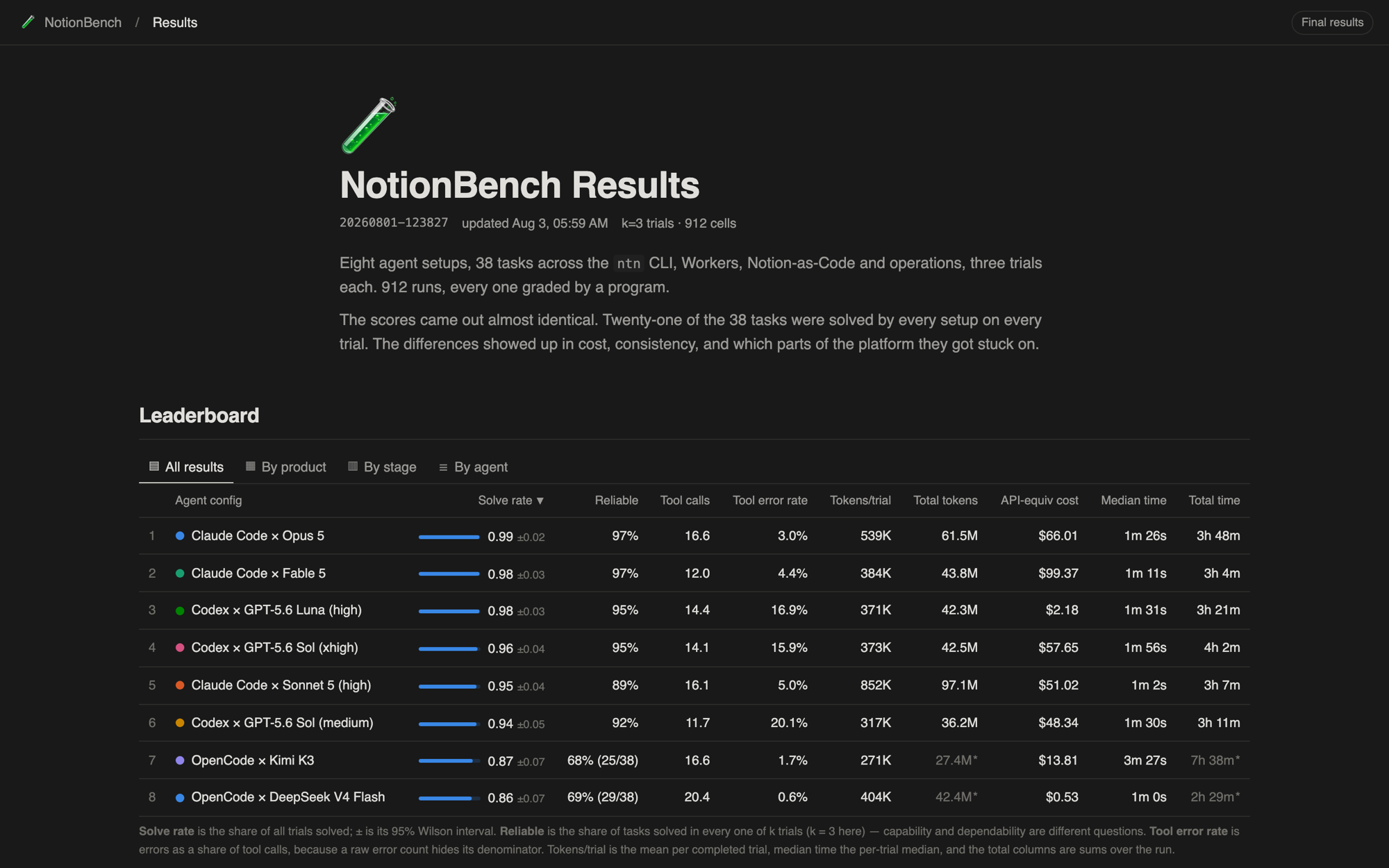
890 of the 912 cells were run and scored; the 22 cells a usage limit prevented are recorded with their reason rather than counted as zero. The site is pure static: no build step, no external requests, system fonts, and charts drawn as inline SVG so the page works from a file on disk and deploys with one command.
06
the next step, as a working prototype
The shipped page answers config-level questions well. The question I kept wanting while writing the findings was task-level: on which tasks do two setups disagree, and what did the failing trial actually say? I built the explorer below for this case study, in React, on the real run data. It adds the two patterns that experiment-tracking tools converged on: a differences-only toggle that hides every task all eight setups solved on every trial (20 of the 38), and a compare-two mode. Every cell opens its trials and the verifier's diagnostic, and the matrix is fully keyboard navigable.
interactive prototype / eval results explorer
Real data from run 20260801-123827. Arrow keys move between cells, Enter opens a cell, Escape closes the panel.
I used Claude Code to scaffold the component from a written spec that fixed the state shape, the metric definitions, and the required states first. I wrote the metric functions to match the shipped site's numbers, reviewed every render against the leaderboard, and rejected two of its defaults: zebra striping (rows carry state) and a spinner-only loading state (replaced with a skeleton that holds the layout).
07
what I would fix
- The mobile leaderboard clips its right-hand columns. The table needs a column picker or a card layout under 640px; the explorer prototype solves this with a sticky first column and horizontal scroll.
- The scatter's direct labels crowd at the top right where five setups sit within a point of each other. A hover-to-lift or a small inset zoom would help more than smaller type.
- The page header says 912 runs where the writeup says 890 finished. The grid size and the scored count should both be on the page, in one sentence.
- Reliability at k=3 is a coarse instrument. Extending to k=5 through the resume flow is already supported by the runner; the column should say which k it is at, which it now does.