case study 02 / 2025 to 2026
PDFSpacer: a direct-manipulation editor for one boring job
A free, no-login tool that inserts writing space between the questions of a PDF and keeps the exported document trustworthy. A year of iteration in public, used by more than 1,200 students a month.
Three rounds of removing options, one export path, one page that is both the landing page and the workspace. The design grew by subtraction.
- role
- designer, engineer, and the person answering the feedback email
- timeframe
- Sep 2025 to Sep 2026 (75 commits)
- surface
- vanilla JS with PDF.js and pdf-lib, no build step, files never leave the browser
- users
- students and teachers arriving from search, mostly on laptops, some on tablets with a pen
open pdfspacer.com (opens in a new tab)source on GitHub (opens in a new tab)
01
the problem
Worksheets, exam packets, and lecture handouts rarely leave room to write. Students either print them and squeeze answers into margins, or open a full PDF editor and learn a design tool to do one thing. The job is small and specific: click where you need room, get a PDF back that still looks like the original, and trust that what you see is what prints.
That last clause is the whole design problem. If the interface makes spacing feel free-form but the exported PDF shifts content unexpectedly, trust disappears on the first export. Everything in the editor is shaped by making the spacer model explicit and keeping the surface narrow.
02
who uses it, and how I know
Users arrive from search with a task already in mind. Search Console shows the queries: add space to PDF for answers, insert space for notes in PDF, make room for writing in a worksheet. They are not browsing a product; they have a file open in another tab. That shaped the biggest decision on the page, which is that there is no landing page, only the workspace.
The feedback channel is deliberately low friction: an email address and a social link inside the export dialog, placed at the moment someone has just seen the output. The most common complaints over the year were about exports, not editing: blurry text, a missing last page, content that drifted between the preview and the file. Each of those became a commit, and together they pushed the export pipeline from rasterized images to true vector output.
03
key decisions
An explicit spacer model, not free-form drawing
- considered
- draw a rectangle anywhere on the page
- an insertion point in source coordinates plus a height
- chose
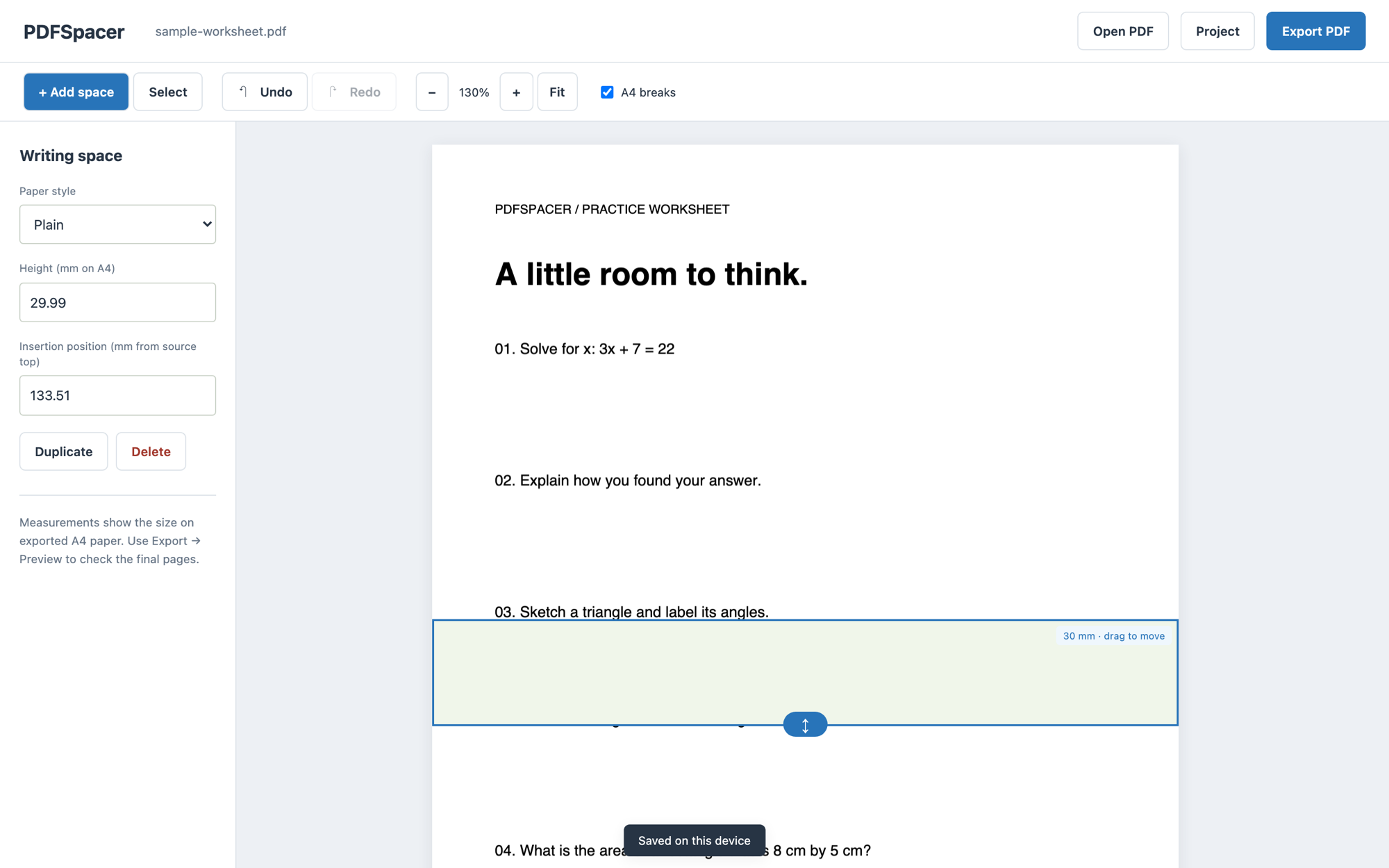
- A spacer is an insertion point on the source page and a height in millimetres. Everything at or below the point moves down by the height. The model is validated, serialized, and the same geometry drives the editor, the A4 break guides, the export preview, and the export itself.
- why
- One geometry means the preview cannot lie. The exported PDF is the preview. The tool also refuses to guess where a question ends; the guide says to click in a clear gap, and the interaction snaps to gaps, because a wrong guess would cut through a line of text.
Direct manipulation that does not misfire
- considered
- click to add, dialog to edit
- drag to move and resize with a click-versus-drag threshold
- chose
- Click in a gap to insert. Drag the body to move, drag the bottom handle to resize, with a 5 pixel threshold so a click never becomes a drag and a drag never spawns a second spacer. Ghost overlays during the drag, frames coalesced with requestAnimationFrame, and one undo entry per completed drag.
- why
- The first version created a stray spacer at the end of every resize. Fixing that meant defining the interaction states precisely: idle, pressed, dragging, and committed. Undo covering the whole drag, not every intermediate frame, is what makes the history usable.
Remove export options until one choice is left
- considered
- render scale plus JPEG quality plus a continuous-flow toggle
- a low, medium, high preset
- vector export always, choose only the page layout
- chose
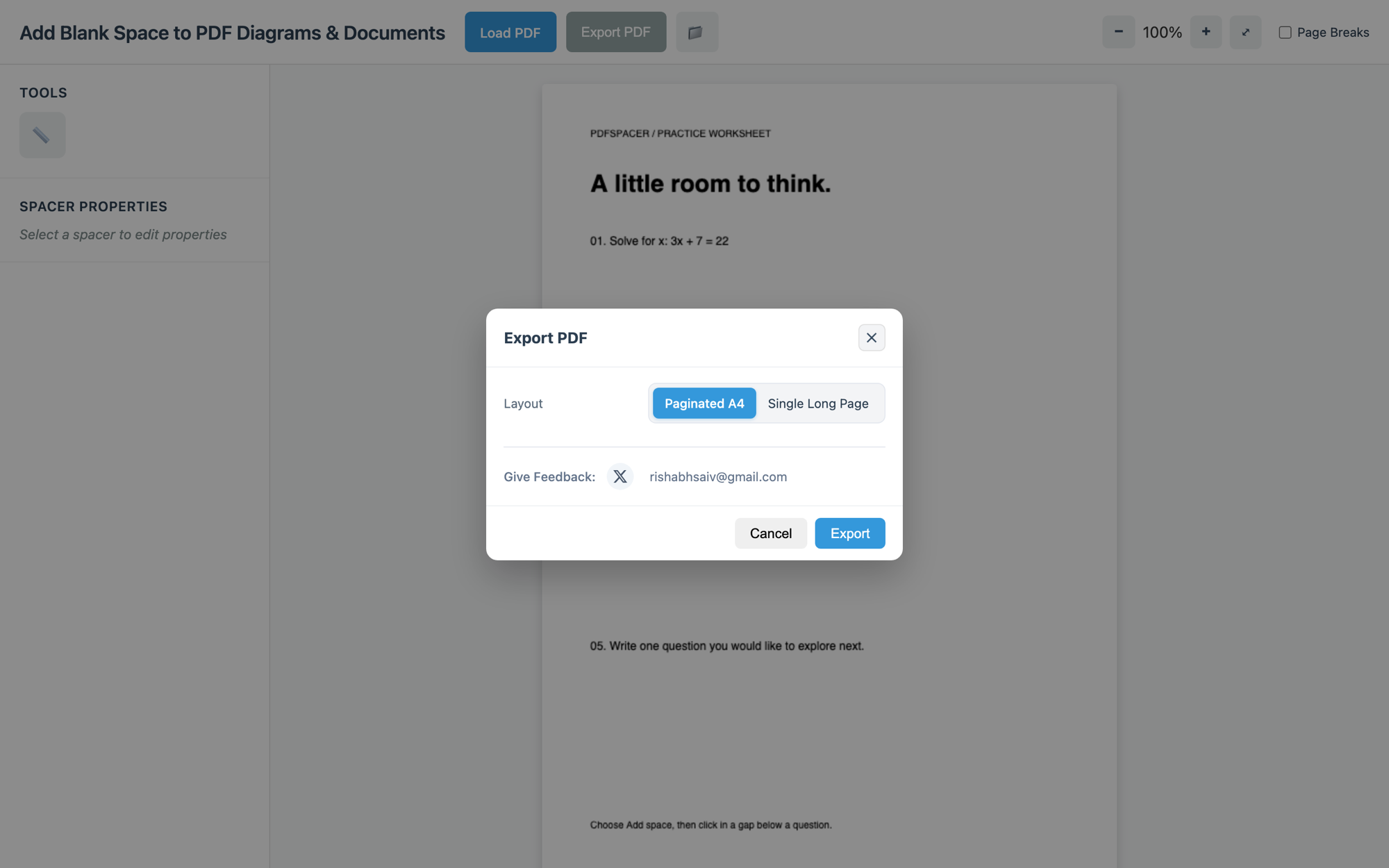
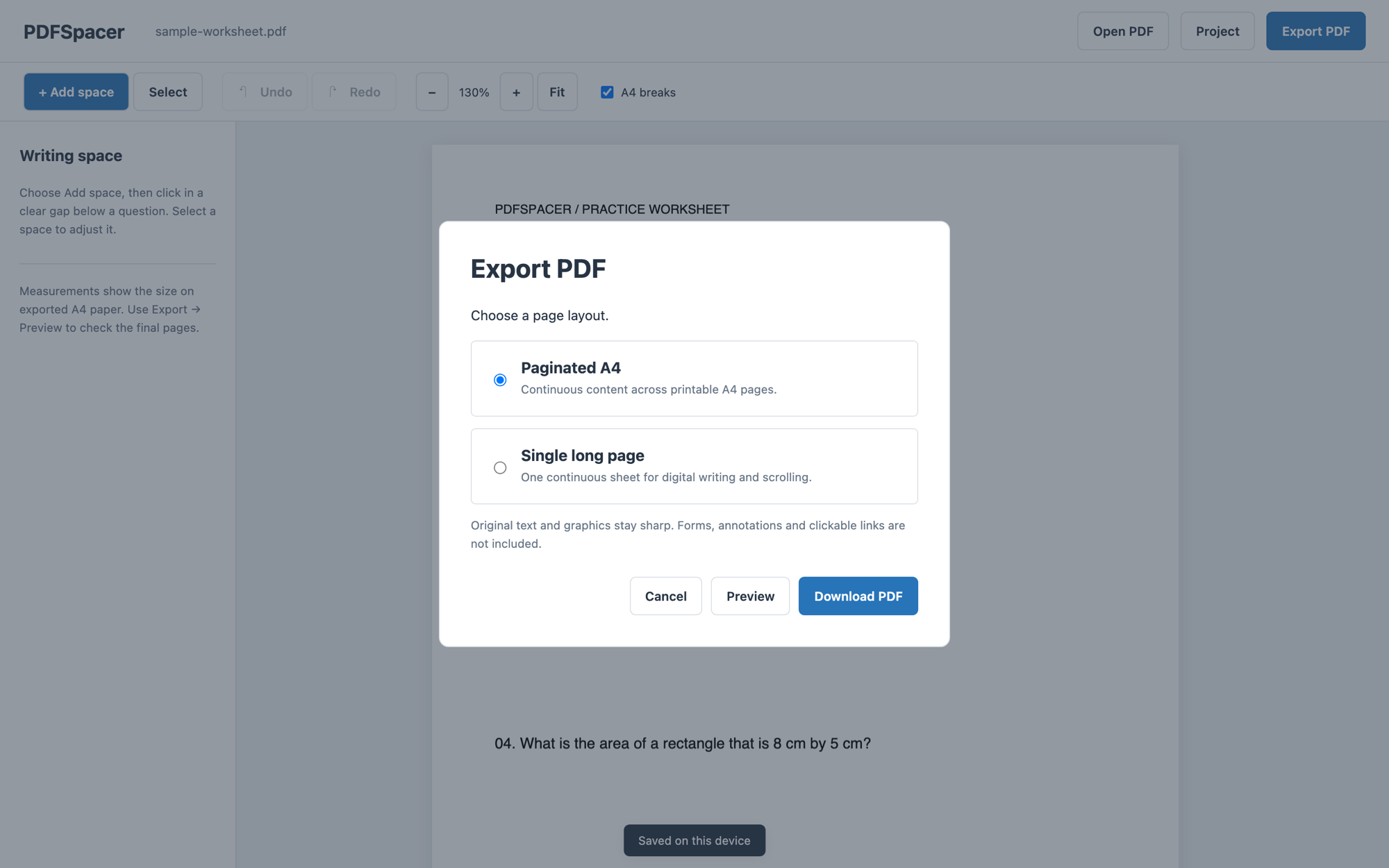
- Vector output every time, so text stays text. The dialog asks one question, paginated A4 or a single long page, and offers a Preview that renders the real output before download.
- why
- Every knob was a way to get a worse PDF. Quality presets existed to work around a raster pipeline; once the pipeline preserved the original text and graphics, the presets had nothing left to do. The only decision a student actually makes is whether they will print it or write on it digitally.
Labels over icons, and fewer panels
- considered
- icon-only tool and property buttons with tooltips
- labelled buttons, and remove the page thumbnails sidebar
- chose
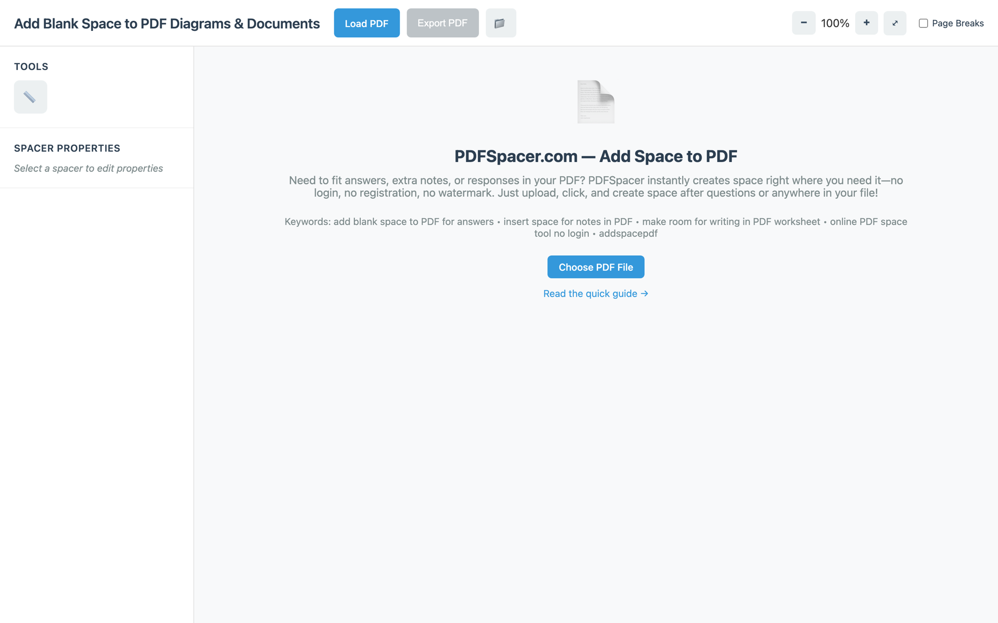
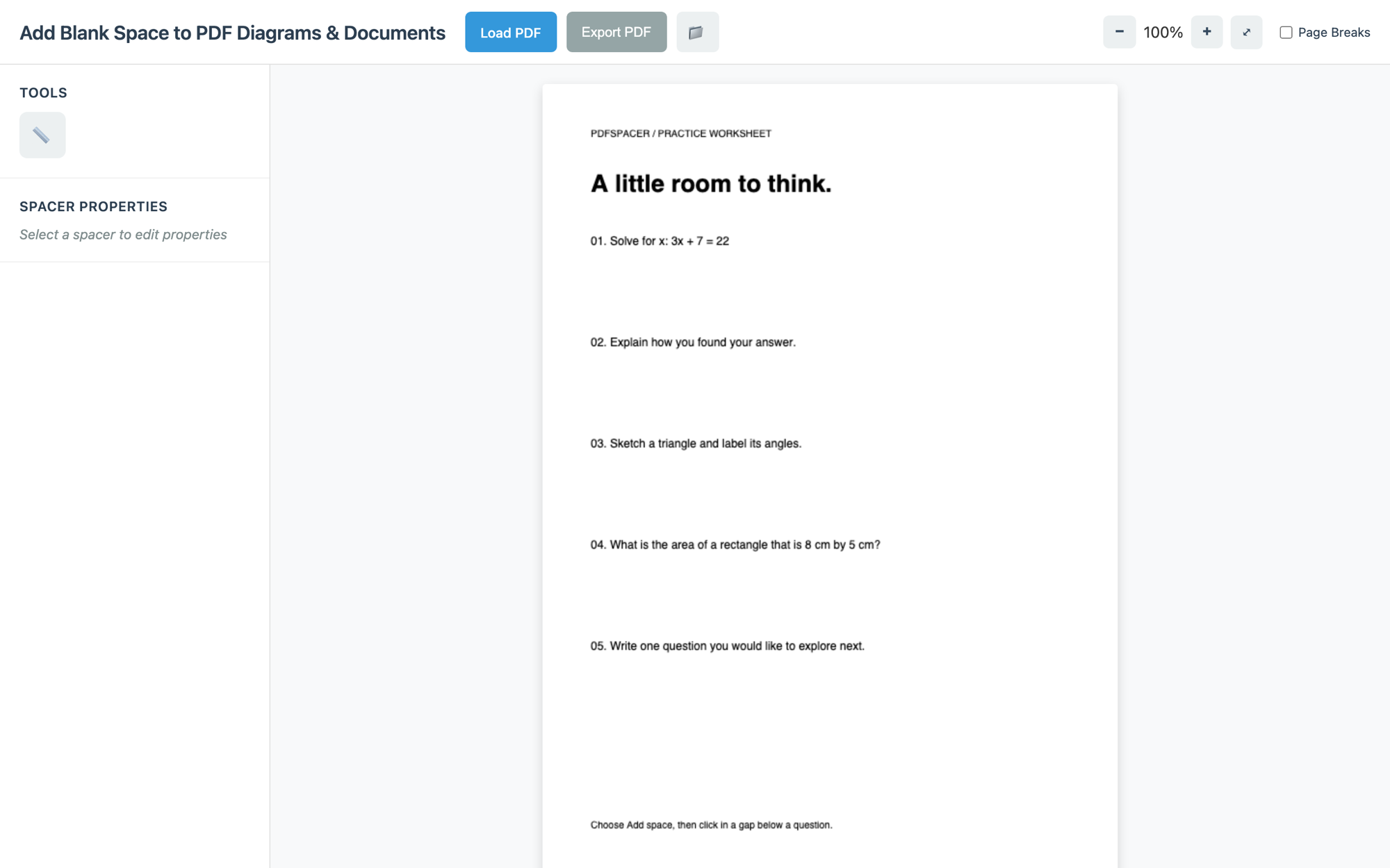
- Duplicate and Delete as labelled buttons, Delete in a danger style. The tool switcher shows words with a pressed state. The page thumbnails sidebar was removed entirely once the viewer became one continuous scroll.
- why
- Icon-only buttons in a tool people use twice a term have no chance to be learned. The thumbnails answered a question the continuous viewer had already answered.
The workspace is the landing page
- considered
- a marketing page that links to the app
- the app itself, with an upload-first empty state
- chose
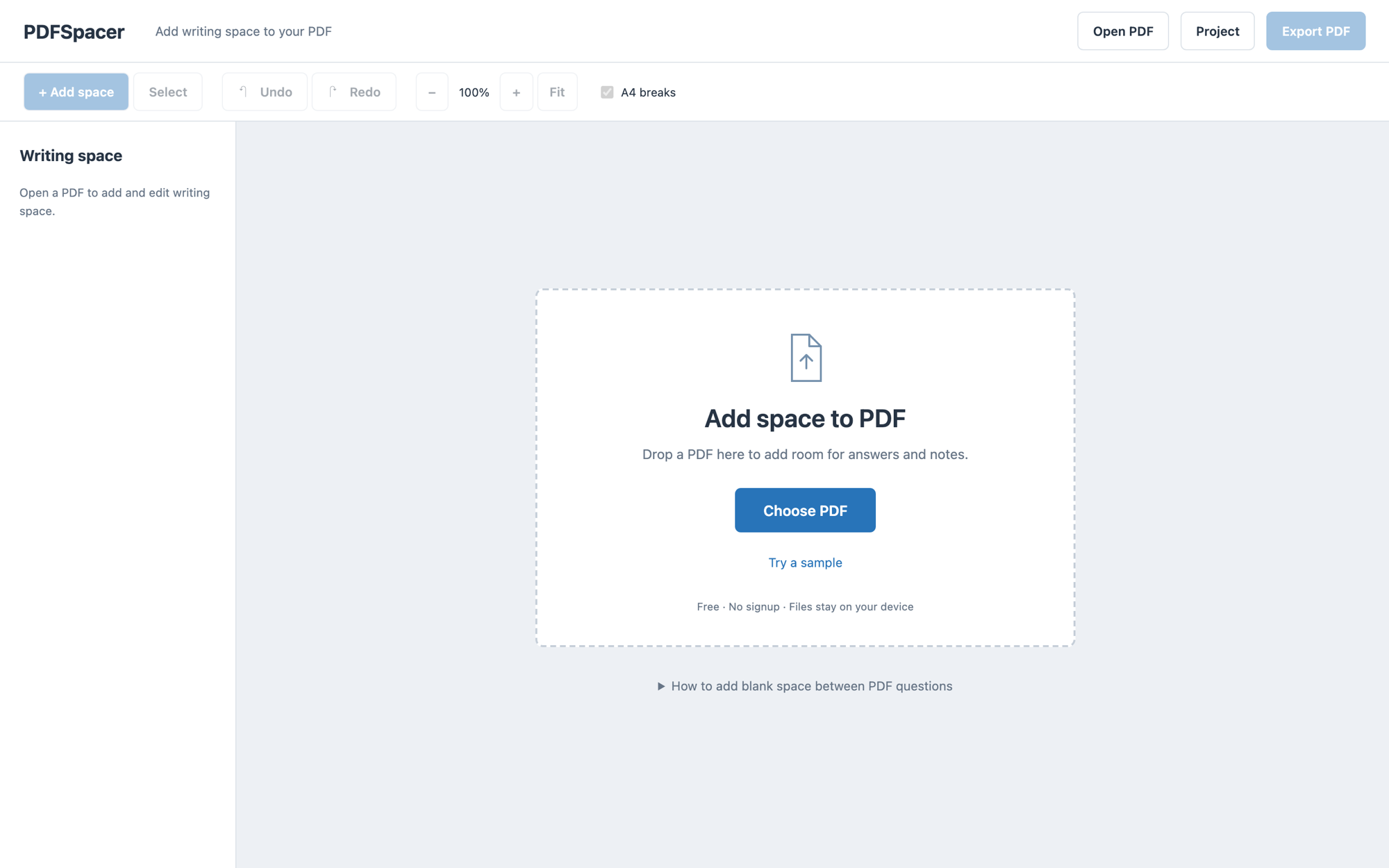
- The homepage opens directly to the editor. The empty state carries the headline, a drop zone, a sample worksheet, the privacy line, and a collapsed three-step guide. In September 2026 I shipped a separate landing page and reverted it the next day.
- why
- Every visitor already knows what they want to do. A page between them and the file picker was a page they had to leave. The empty state does the landing page's job without a second URL, and the sample lets someone try the interaction without a file.
Measurements in millimetres on the exported page
- considered
- pixels at the current zoom
- millimetres as they will print on A4
- chose
- Every height and position reads in millimetres on A4, whatever the zoom level. A4 break guides are on by default so a spacer that would split content is visible before export.
- why
- The number a student cares about is on paper. A 120 screen pixel drag at 120% zoom should produce a 100 point move in the file, and the interface should say so in units that survive printing.
Nothing leaves the device, and nothing is lost silently
- considered
- upload to a server for rendering
- process in the browser, persist to IndexedDB
- chose
- Rendering, editing, and export happen in the browser. The document and the layout are saved to IndexedDB in one transaction. A visible warning identifies a failed autosave, and the layout can be downloaded as JSON, which the loader verifies against the PDF's fingerprint.
- why
- Exam papers are private. And a tool people reach for in the middle of homework has to survive a refresh; a silent save failure would be worse than no save at all.
04
before and after
Jan 2026
Sep 2026
Jan 2026
Sep 2026
Jan 2026
Sep 2026
- Sep 2025: first version in two days. Page thumbnails, an icon tool palette, jsPDF raster export, and a placement guide nobody could find.
- Sep 2025: continuous scroll viewer, page-break overlays, ghost overlays for drag and resize, session persistence, and the fix for stray spacers after a drag.
- Jan 2026: the export complaints. Render scale raised, then presets, then a vector pipeline with a raster fallback, and feedback links inside the dialog.
- Sep 2026: the rewrite. One validated layout model, one exporter for both modes, export preview, IndexedDB with fingerprint-checked imports, Pointer Events for pen and touch, a full keyboard model, and geometry regression tests for the PDFs that had broken it.
05
what shipped
- More than 1,200 students a month, no account, no watermark, and a homepage that is the tool.
- About 1,400 lines across five files. No framework and no build step, so the app loads from a static host and can be read end to end.
- Keyboard: undo, redo, delete, and arrow nudges with a shift modifier. Focus rings are a 3 pixel amber outline chosen for contrast against the blue controls. Status messages go through a live region.
- Export preserves original text and graphics; scans stay images. Forms, annotations, and links are stated as not carried over rather than silently dropped.
06
the interaction model, as a prototype
The screenshots cannot show the part that took the longest to get right, which is how the spacer behaves under your pointer. The prototype below reimplements the geometry and the interaction states on a fake worksheet: insert in a gap, drag to move, drag the handle to resize, nudge with the keyboard, and watch the A4 break guides and the export preview recompute. It shares no code with the shipped app; it was built for this page in React so the model could be read in one file.
interactive prototype / spacer interaction model
Choose Add space and click in a gap. Arrow keys nudge a selected space by one millimetre, shift for ten, Delete removes it.
07
what I would test next
- First-click success in the add tool on scanned worksheets, where the gap between lines is visual, not structural. The pointer guide line is my current answer; I want to watch five students use it before trusting it.
- Whether A4 breaks on by default confuses people who only ever export the long page. A per-mode default is the obvious alternative.
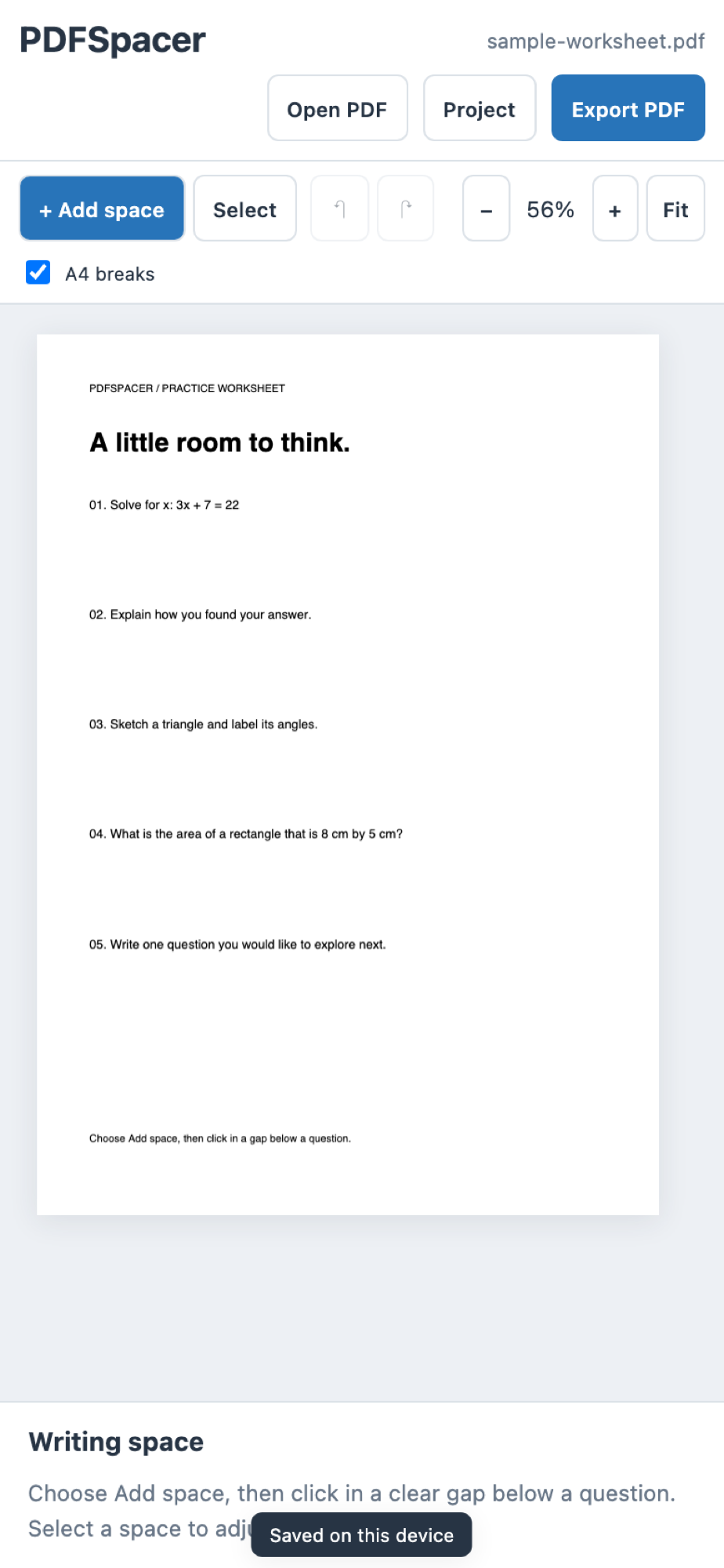
- Discoverability of the properties panel on phones, where it sits below the document and a selected space may be off screen.
The repository carries an AGENTS.md that states the architecture and the rules: no framework, no build step, small functions over abstractions. Coding agents did a large share of the September rewrite inside those constraints. I set the constraints, wrote the interaction rules, and tested every export against the worksheets that had broken earlier versions.